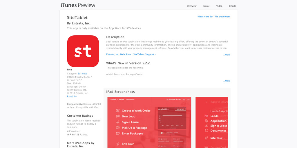
SiteTablet
![]()
During my first year at Entrata, SiteTablet fell under my product umbrella, and has remained under my direction since. Version 2.0 had already been released when I started working on the product which at the time was limited to gathering leasing information, and connecting to web-wrapped content. Performing a product audit, and some early user testing I overhauled the interface, workflows, and functionality in version 3.0, which grossed $1 million in annual revenue in its first full year. In 2016 I reshaped the app to match the Entrata rebrand, along with motion design and and smart analytics to help shape the experience. SiteTablet has won several awards for design and usability, as well as a number of industry awards for innovation.
Experience with Product: 6 years 6 months


The Process
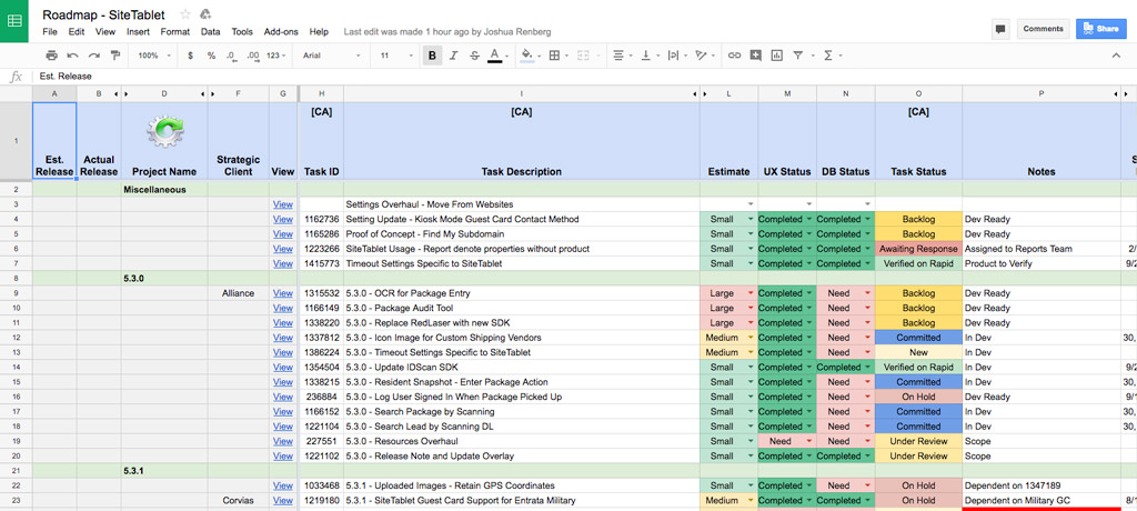
Research 3, 6, 9, and 12 Month Planning
Doing a product review, I took questions on-site visits to around a dozen users in the western United States. On-site, while watching them use our product, I also asked a series of questions and gather feedback on the current version of the app.
Roadmapping 3, 6, 9, and 12 Month Planning
Our three-person strategy team reviewed our current product and using analytics scoped out the new release in phases. The version 5.0 release was set for the following year, with 3-month sprints of the UX process until the eventual release.
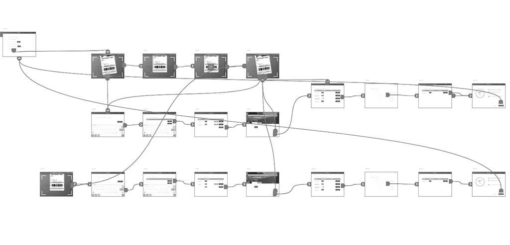
Wireframing Low Fidelity Design
Since I was working off a previously successful version of the app, there was minimal wireframing of the interface. I did, however, have to architect out the workflows where they changed to take advantage of new technology and improved usability.
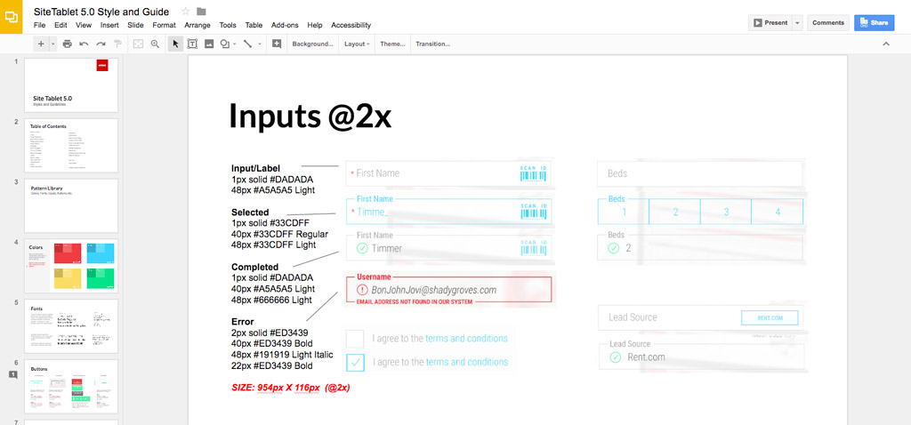
Style Guide Design
A big chunk of the design phase was a new style guide to meet branding requirements to match the company rebrand, and fit into the mobile framework and pattern library I started developing with the ResidentPortal app.
Mockups High Fidellity Design
The design phase spanned the entire project with large sections of the app completed in the first couple months, and enhancements following during each sprint.
User Testing Slideshows & "Touch Prototypes"
Creating a touch prototype we were able to put the app in front of users and get feedback on our updated workflows. We also instituted an internal testing regiment where new hires were brought in on a weekly basis an run through the tests for additional feedback.
Corporate Feedback Research
A major push for the redesign were several large customers who were using a competitors product. During the User Testing phase, we met with these clients and others and discussed the previous version, the new version, our UX changes, and gathered additional feedback.
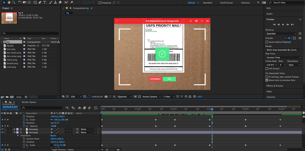
Motion Design
While I cleaned up mockups post user testing, my team began motion design to bring the app to life. We met several times each week to look at concepts, discuss animations, and review output.
Production Mockups Design
The final step was a review of all the screens making sure everything was pixel perfect and ready for development to take over. With executive sign off the app was off to development.
Product Release 12 Months later
From the project kickoff in the September 2015, version 5.0 was released on the App Store on September 16, 2016.
The Product
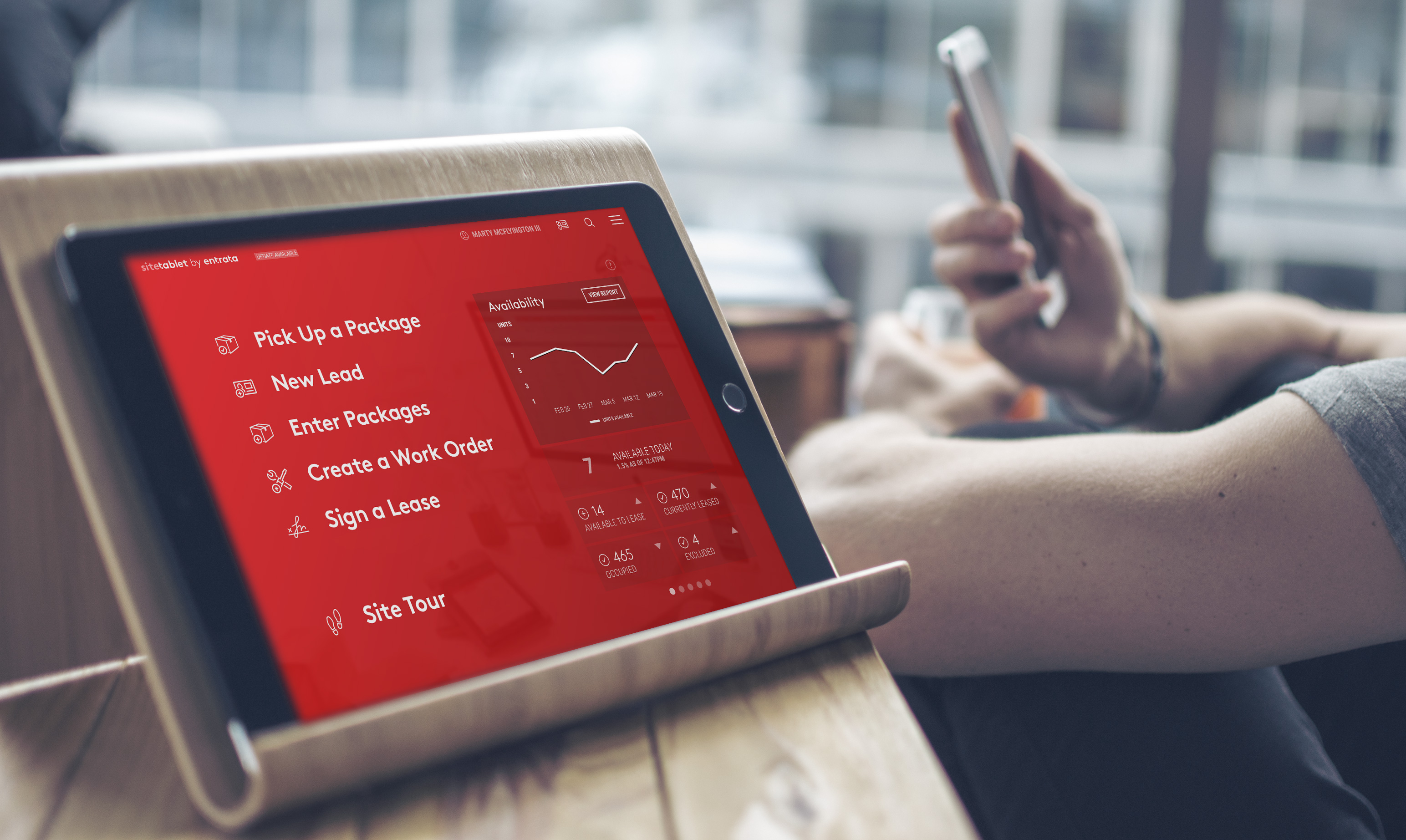
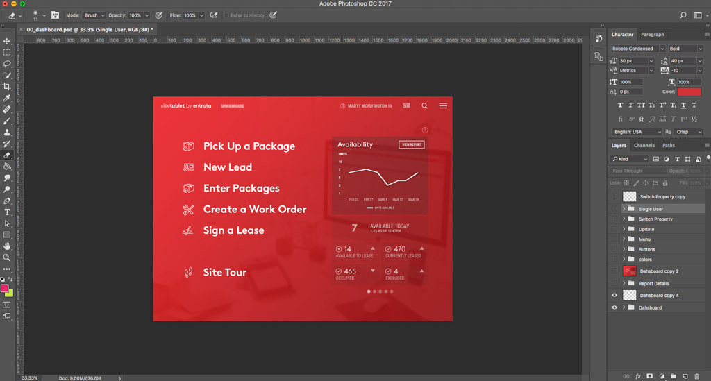
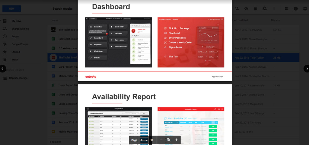
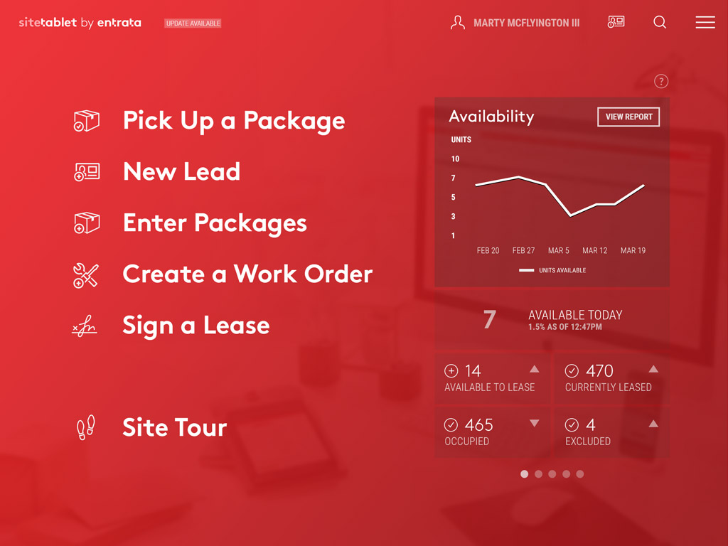
"Smart" Dashboard
With each iteration of the SiteTablet dashboard, I have worked to simplify the experience, and focus the user on the information they access most. In the current version, 5.0 we tapped into click tracking to log the most used functions on the app. This helps generate the main menu on the dashboard. Through research I found most users were focused on 3-4 major task operations on a daily basis. After a few days of using the app the main menu typically is centered around the user saving them time getting work done. The report on the right hand side pulls in data related to that users most used functions as well, providing valuable information to help improve the interaction between the user and their customers.
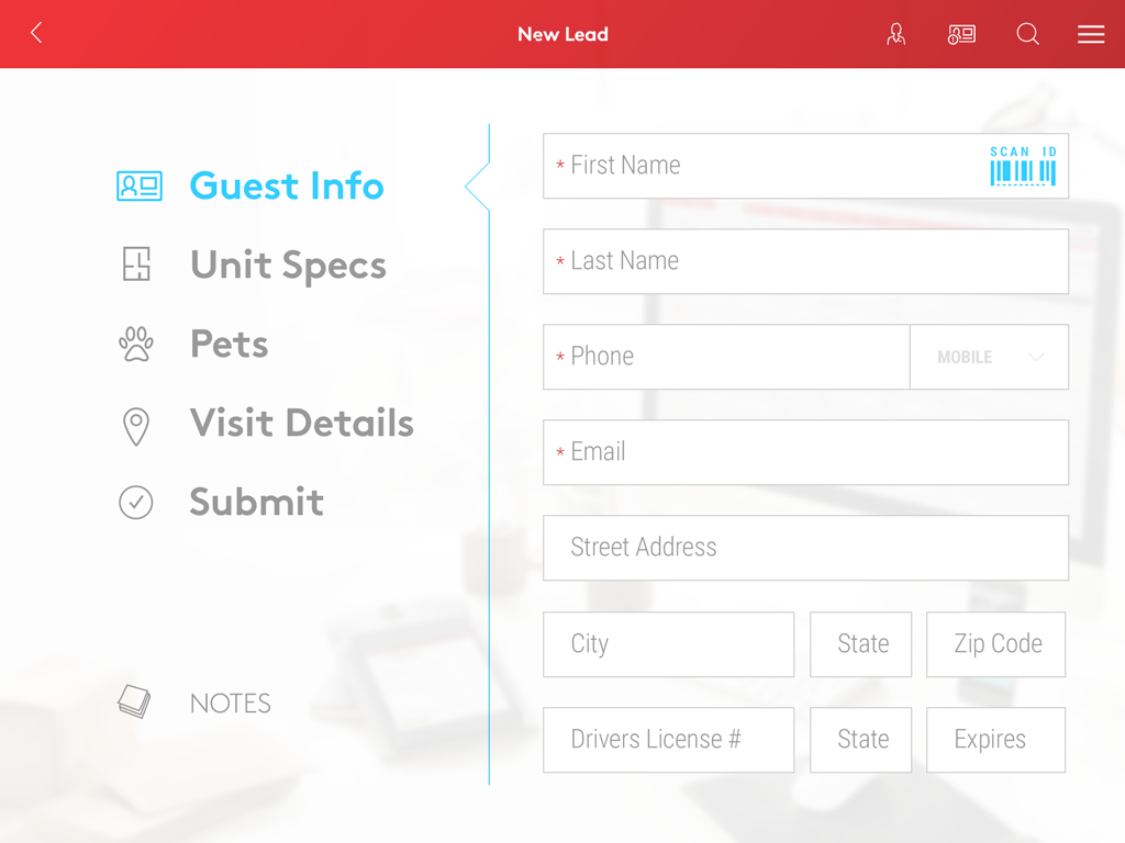
Forms Simplified
Like other apps I've created at Entrata, a major focus on our mobile solutions is to simplify sometime complex processes. In many cases the amount of information our clients need to request form users can become overwhelming. With SiteTablet I worked on trimming what we could, and working with business owners to figure out what the minimum viable amount of information needed was across workflows. I then cut these into smaller chunks allowing for focused data entry, that gives the impression of entering less information while still getting what the client needs.
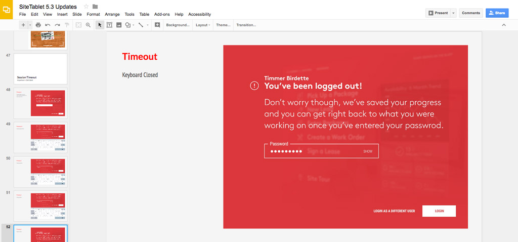
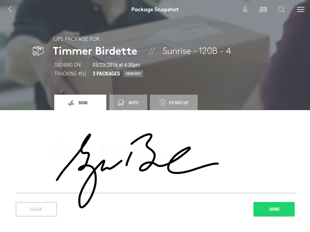
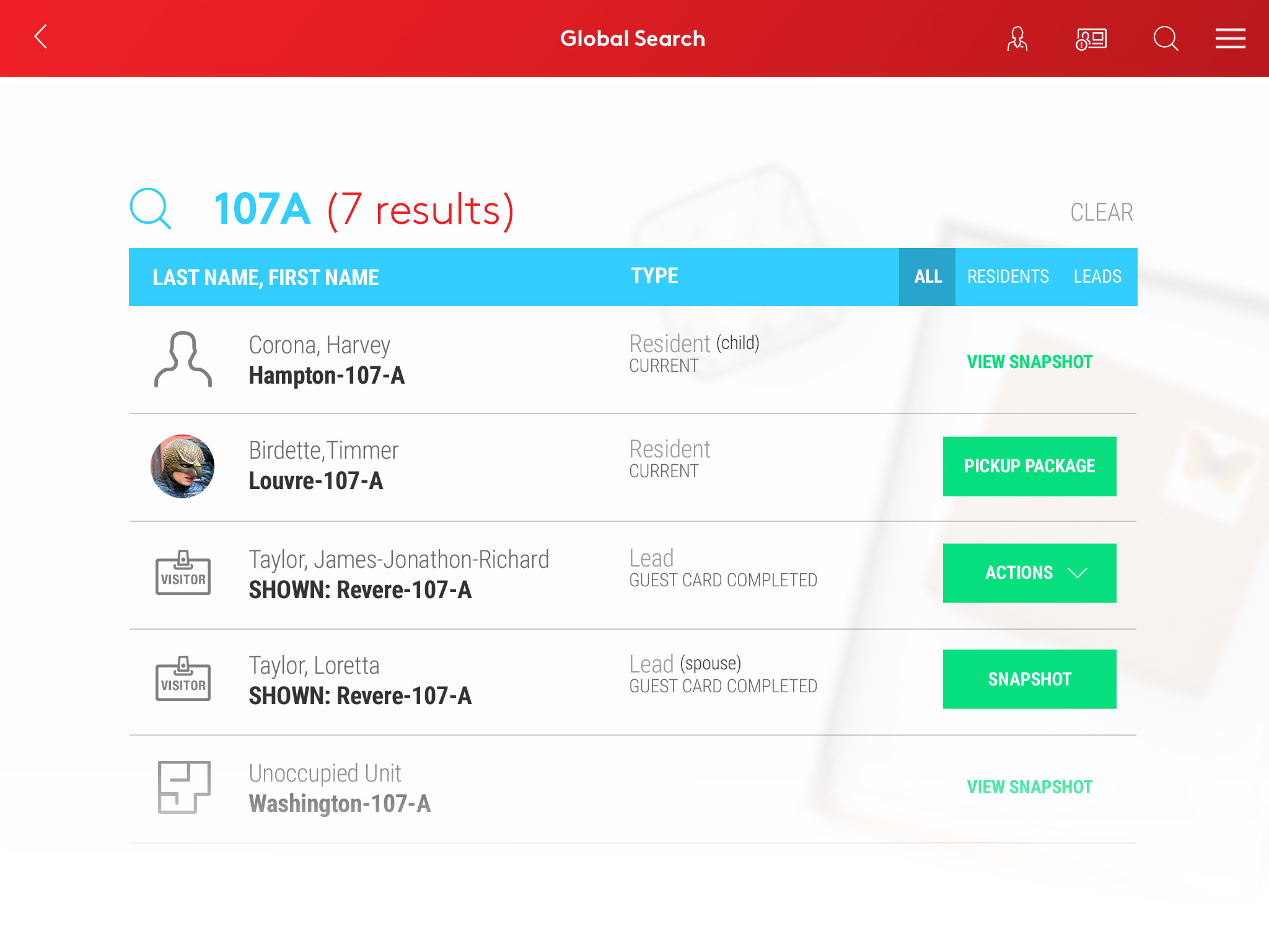
"Snapshot" Views
I created a standard visual layout for anytime a user had to look at information that differed dramatically from the data entry interface. I wanted to convey the feeling that this was a “snapshot” into a piece of information--with the bare minimum information available to get the user in and out as quick as possible. Not only did they provide an obvious contrast to the data entry portions, but they were visually appealing.
Action Lists
In contrast to our desktop application where we generally provide a lot of information in lists, due to requests and requirements form various clients, in the app I was able to remove in many cases what was information overload from lists. Most lists in the app consist of 3 to 4 data points then a focused action if available. Specifically for search result users provided feedback that these actions often saved them several clicks to get where they needed to go.
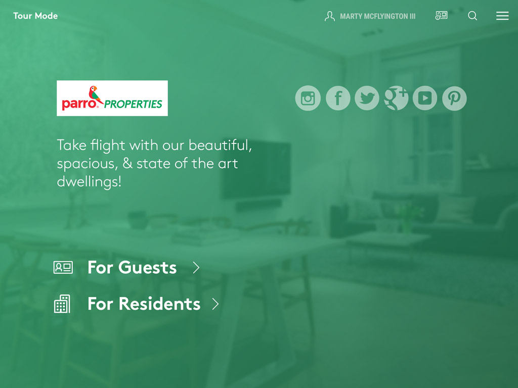
SiteKiosk
Aside from the app being a tool for leasing agents to be more productive and mobile, we also built in the ability to use the app as a sales device in leasing offices. With job shadowing I often found myself watching leasing agents engaged with customers leaving others waiting in the lobby. What if we could provide a marketing tool that allowed customers to get hands on with property information, much like a leasing website? This idea transformed into SiteKiosk--or tour mode where the property could lock the administrative functionality on their tablets, and provide a branded marketing interface for their customers to learn about the property, the unit availability, etc, while waiting to be helped.
Marketing Video from Motion Design
Used during product launch at Entrata Summit 2016, the marketing video announced the long awaited visual update to SiteTablet 4.0, which had the same interface from version 2.0 launched in 2012. The video was the culmination of hours of work that went in to the actual motion design of the product. While I did not create the video, my team developed the motion and interactions that were used in the final product.