MWBIRDCO
![]()
Unlike most products I've worked on in my career, MWBirdCo isn't just a product, it's my own company and not at all related to user experience design. That doesn't mean I haven't tried to bring the principles I use in UX into my own business (during design and while guiding). Created in 2008 to take people on bird watching tours, my company has grown from a small 3-4 tour a year outfit, to guiding 50-100 birders every year for a variety of tours all over the western United States.
Experience with Product: 10 years 8 months
Sleek Responsive Design
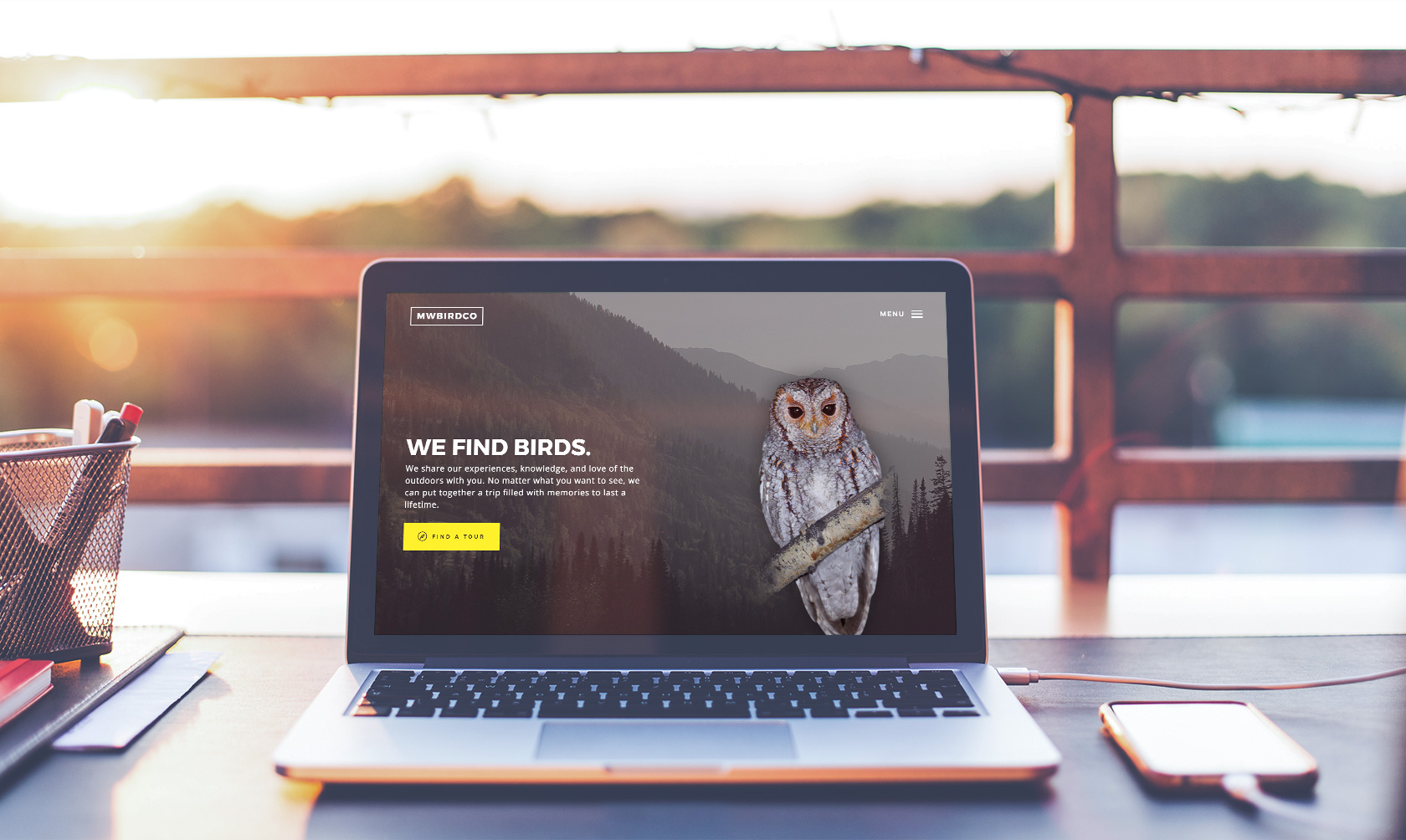
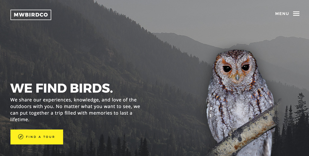
Since starting the business in 2008, the website has gone through 4 major redesigns. Keeping up with the times, and trying to build a brand required coming up with unique designs that stood out against the competitors. In the most recent phase, I redesigned the website in 2016 to go along with a rebranding effort. This gave me an opportunity to play with a wide variety of HTML, CSS, and Javascript to provide an enjoyable experience taking advantage of motion and other effects to draw the user into the interface.
Focused Pricing
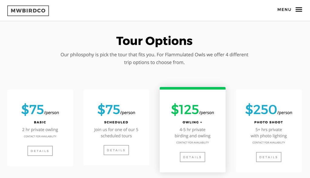
After years of standardized pricing, I started testing out tiered pricing with a focus on prices that provided a good value proposition for the customer while also working in my favor as a business owner. By highlighting the price point I wanted to sell most I found that 93% of my clientele ended up picking the highlighted option even when other options were less expensive or provided a similar experience. While this may just be a correlation, it certainly had a positive effect on business.
Logo Design
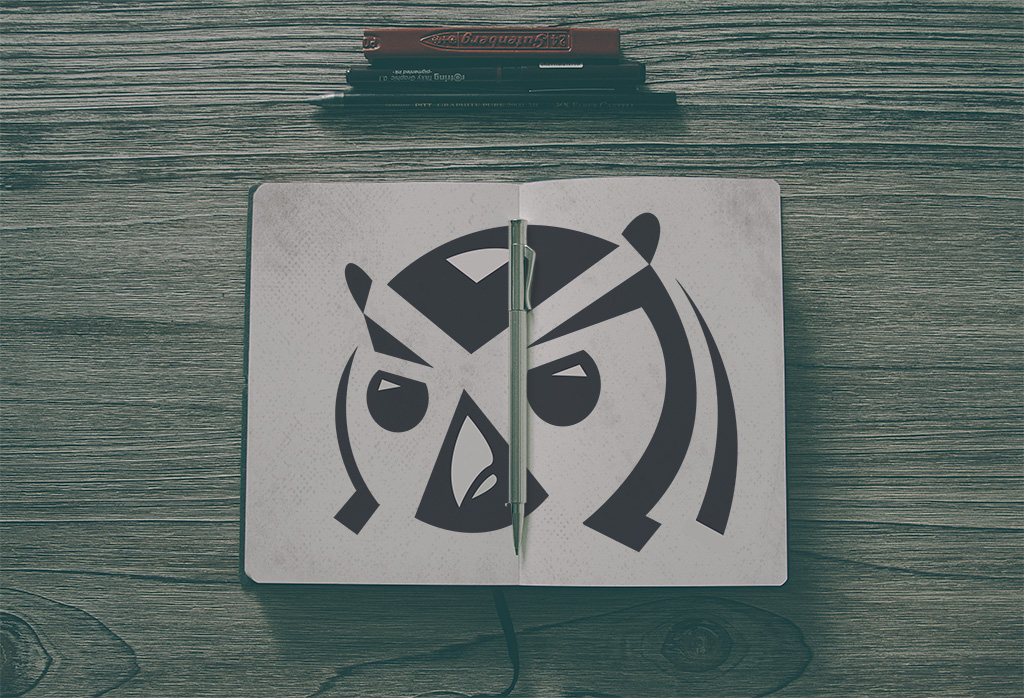
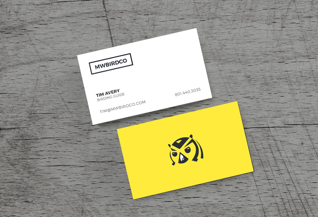
Over the first 7 years of business, I used 3 different logos. The first was a poor choice of a bird that wasn't found anywhere in America and represented a bad brand decision. This was followed up with a hawk silhouette that at least made sense for where the business was located but wasn't generally exciting. I followed this up with a falcon that was similar to the style of my current brand but had no real tie into my business other than being a bird. Eventually, I ended up with the Flammulated Owl--which made the most sense given that 96% of my clients come for owls!
Business Cards
Keeping with the theme of standing out from competitors, when I rebranded I decided to go for business cards that would also stand out. I looked at various ideas and options that ranged from an odd shape/size to cutouts, and a variety of different coatings to provide depth. In the end, I went with a layered card with a thick black center. The cards were as thick as 5 standard business cards so they had weight to them. The dark center contrasted with the yellow and white sides creating a stark appearance.
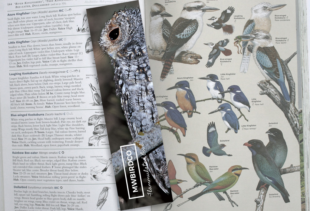
Bookmarks
At the end of a tour, I like to wrap things up with a few marketing materials for clients to take home and even share if it will help grow my business. I have used pens, water bottles, stickers, and several other easily disposable items. While trying to think of something that would be useful for bird watchers I looked to a field guide and realized a bookmark might be the perfect parting gift. Something they can stick in their guide and have every time they open it up--thus the Flammy bookmark was born!